Why Visitors Ignore Half Your Homepage Within Three Seconds
 Your homepage gets judged faster than a biscuit dropped near a Labrador.
Eyes Do Not Read They Hunt
Visitors do not arrive calmly, fold their hands, and admire every carefully approved section of your homepage. They scan. Their eyes jump toward contrast, faces, motion, large headings, familiar shapes, and anything that looks immediately useful.Within seconds, they decide what matters. Everything else becomes expensive wallpaper.
Eye-tracking studies often show predictable patterns: people notice strong headings, clear images, buttons, and content placed where they expect it. They ignore vague banners, decorative clutter, and anything that resembles an ad. This is unfortunate news for the heroic stock photo of three people pointing at a laptop, but somebody had to say it.
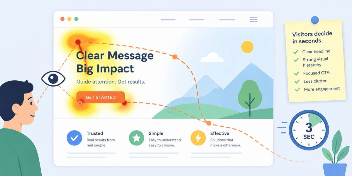
Visual Hierarchy Is Your Traffic Controller
Visual hierarchy tells the visitor where to look first, second, and third. Without it, your homepage becomes a roundabout with no signs and six drivers named Keith.The biggest mistake is making everything important. When every section is bold, bright, animated, boxed, and shouting for attention, nothing wins. The visitor's brain quietly leaves the meeting.
A strong homepage usually has one obvious primary message, one clear next action, and supporting content arranged beneath it. Size, spacing, contrast, and placement should work together. Your headline should dominate. Your call-to-action should be easy to find. Secondary details should support the main path instead of mugging it in an alley.
Common Reasons Important Content Gets Missed
- Hero sections with vague headlines that sound impressive but explain nothing.
- Calls-to-action placed too far down the page.
- Low contrast buttons that blend into the design like shy furniture.
- Too many competing images, icons, pop-ups, badges, banners, and announcements.
- Navigation menus packed with choices nobody has the energy to decode.
Clarity Beats Decoration
Good design is not about filling space. It is about directing attention. A homepage can look beautiful and still fail if the visitor cannot quickly understand the offer. Visual polish helps, but clarity does the selling.Spacing Is More Powerful Than Most People Realize
Many homepage problems are not caused by missing elements. They are caused by elements sitting too close together.When everything is crowded, the brain has to work harder to separate one message from another. That extra effort may sound minor, but online attention is fragile. Every unnecessary decision increases the chance that someone leaves before reaching the information you wanted them to see.
White space acts like a spotlight. It creates separation, establishes priorities, and gives important content room to breathe. A button surrounded by generous space often attracts more attention than a larger button trapped inside a crowded layout.
This is one reason luxury brands often use minimal designs. They are not wasting space. They are controlling attention with remarkable precision.
The Dangerous Pull of Banner Blindness
Visitors have spent years training themselves to ignore things that resemble advertisements. This behavior happens so quickly that many people do not even realize they are doing it.If your most important message sits inside a brightly colored banner that looks like a promotional ad, users may skip it entirely. Their brains classify it as irrelevant before consciously processing the content.
The same problem appears with oversized sliders, flashing promotions, and rotating carousels. Website owners often love them because they can display multiple messages. Visitors often treat them like background scenery.
A rotating homepage carousel can feel a bit like a waiter changing the menu every three seconds while you are trying to order lunch.
Guiding Attention Without a Full Redesign
Improving homepage engagement does not always require months of work or a complete visual overhaul. Small changes can produce meaningful results.Consider these practical adjustments:
- Make your primary headline more specific and benefit-focused.
- Increase the size or contrast of your main call-to-action.
- Reduce competing elements near critical content.
- Use stronger visual contrast between sections.
- Move important information higher on the page.
- Add meaningful subheadings that support scanning behavior.
- Remove decorative graphics that distract from key actions.
What Eye Tracking Reveals About Trust
Research consistently shows that people pay attention to signals that reduce uncertainty. Clear product information, testimonials, recognizable client logos, pricing details, and concise explanations often receive significant attention because they help visitors answer an important question: "Can I trust this?"When these trust-building elements are hidden beneath decorative content or buried far down the page, visitors may never reach them.
This becomes especially important for businesses with longer sales cycles. If users cannot quickly find evidence that supports your claims, they may leave and continue their search elsewhere.
Keeping an Eye on the Prize
Most homepage visitors are not deliberately ignoring your content. They are following natural scanning behaviors developed through years of browsing websites, apps, and search results.The challenge is not getting people to look at everything. The challenge is getting them to notice the right things first.
A homepage with clear hierarchy, focused messaging, thoughtful spacing, and strong visual cues helps visitors move naturally toward the information that matters most. When attention is guided effectively, engagement improves, important content gets seen, and fewer critical messages end up hiding in plain sight like a celebrity wearing sunglasses indoors and hoping nobody notices.
Article kindly provided by nulamedia.co.uk
Latest Articles
- Why Visitors Ignore Half Your Homepage Within Three Seconds
- Why Most Cybersecurity Conversations Ignore the Biggest Vulnerability: Everyday Workflow Habits
- What Your Workplace Is Communicating Before Anyone Says a Word
- Planning an Office Renovation? Why Drywall Decisions Impact More Than Just the Walls
- The False Economy of Low-Cost Protective Solutions
- The Valuable Materials Hiding in Everyday Electronics
- The Hidden SEO Asset Most Small Businesses Ignore: Why Directory Listings Still Matter
- How to Renovate Without Losing Productivity: A Smarter Approach to Workplace Upgrades
- How One Day of Filming Can Become Months of Content
- The Invisible Traffic of Office Air: How Dust, Odors, and Allergens Move Through Workspaces
- From Gravel to Concrete: When Businesses Should Upgrade Outdoor Access Areas
- Landscape Design as Infrastructure: How Outdoor Spaces Influence Business Performance
- Why Venues Matter More Than Gear in Premium Photography
- What Perfume Sampling Reveals About Modern Buying Behaviour
- The Hidden Operational Cost of Delaying Vehicle Glass Repairs
- How Air Quality Became the Silent Workplace Issue Nobody Talks About
- How to Shoot for Post-Event Content Pipelines, Not Just the Day Itself
- Common Data Backup Mistakes People Make Without Realizing
- Concrete Surfaces Built for the Long Haul
- Why Commercial Lighting Design Keeps Missing the Mark
- Sales and Marketing
- Human Resources
- Finance and Accounting
- Business Consulting
- Information Technology
- Supply Chain Management
- Manufacturing and Production
- Logistics and Transportation
- Risk Management
- Project Management
- Market Research
- Business Intelligence
- Customer Relationship Management
- Product Development
- Quality Assurance
- Outsourcing Services
- Procurement and Vendor Management
- Legal and Compliance
- Business Strategy
- Operations Management
- Leadership and Management
- Data Analytics
- Innovation and R&D
- Training and Development
- Ecommerce Solutions
- Public Relations
- Advertising and Promotion
- Branding and Identity
- Business Networking
- Event Management
- Office Environment