Why Many New Businesses Launch With the Wrong Kind of Website
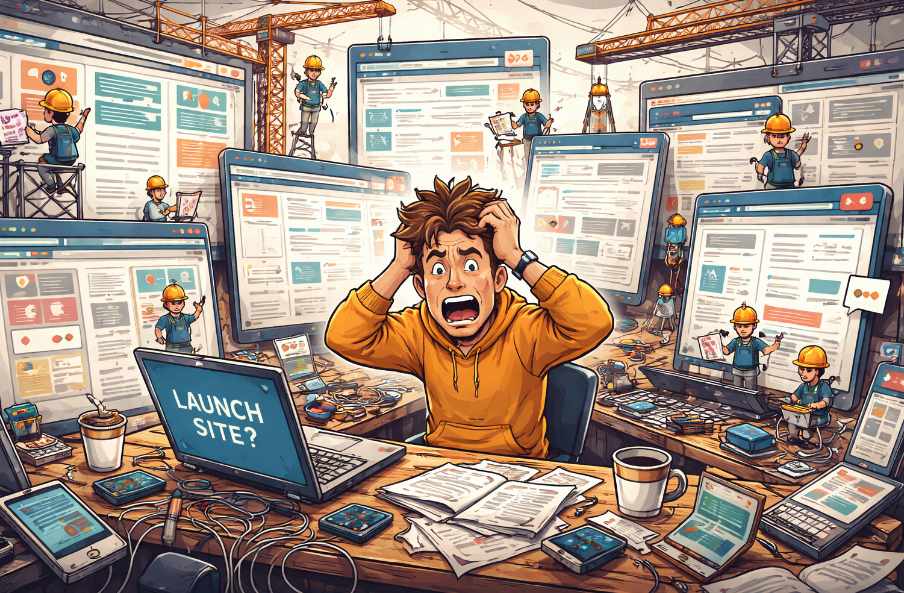 Somewhere between the excitement of launching a new business and the reality of building its online presence, many founders make the same mistake. They try to build a website that does everything immediately. Online booking, member portals, animated sliders, five service sections, three landing pages for ads that haven't even been planned yet, and a blog category structure worthy of a multinational corporation.
The intention is understandable. A new business wants to look established, impressive, and ready for anything. Unfortunately, the result is often a complicated website that confuses visitors and exhausts the budget long before the company finds its footing.
Many startups discover within a year that the impressive digital structure they launched with is no longer useful. The services changed. The messaging evolved. The navigation that once seemed clever now feels like a maze designed by someone who really likes dropdown menus.
Ironically, trying to build the "perfect" website early on usually creates the opposite outcome. Instead of supporting growth, the site becomes an expensive obstacle that requires a rebuild just when the business finally understands its audience.
Ambition Outrunning Practicality
New businesses tend to imagine their website as a finished monument rather than a flexible tool. This leads to decisions that prioritise features over clarity.A typical startup planning session might include statements such as:
- "Let's add a client portal in case we need it later."
- "We should probably have separate landing pages for twenty different services."
- "Could the homepage have a video background of drones flying over mountains?"
A complex website locks those early assumptions into place.
This creates a quiet but expensive tension. The business grows in one direction while the website stubbornly represents the version of the company that existed during its first enthusiastic brainstorming session.
Visitors Prefer Clarity Over Cleverness
Customers arriving at a startup website usually have simple questions.What does this business do?Can it help with my problem?How do I contact them?
When a website tries to present too many options, these basic answers become surprisingly difficult to find. Navigation menus multiply. Service descriptions overlap. Calls to action compete with one another like enthusiastic salespeople all speaking at the same time.
Clarity beats complexity almost every time.
A focused website might include just a few key sections:
- A homepage that clearly explains the main service
- A concise services page describing the core offering
- A short about section building credibility
- A clear contact page
People rarely arrive at a new business website hoping to admire its architecture. They arrive hoping to solve a problem quickly.
A website that communicates clearly often outperforms one filled with clever design tricks, elaborate layouts, and interactive features that require a small instruction manual.
Even search engines tend to reward simplicity. Clean structure, clear page topics, and logical navigation help both humans and algorithms understand what the business actually offers.
Meanwhile, the overly ambitious startup website quietly struggles under the weight of its own creativity.
Start Small but Build Smart
A startup website should behave more like a well-designed workshop than a finished museum. Tools are arranged for practical use, space exists for future additions, and nothing is bolted permanently to the floor.This is where scalable design becomes important. A lean website does not mean a careless one. It simply means building with expansion in mind rather than expansion already installed.
Instead of launching with ten service pages that may never be used, a startup can begin with one clear service category and expand later when demand proves it necessary.
Instead of a complicated user dashboard, a simple enquiry form might do the job perfectly well for the first year. It will not impress anyone at a tech conference, but it will allow customers to contact the business without needing a password, a tutorial, or mild emotional support.
Smart structure leaves room to grow. Navigation can expand. New service pages can be added. Blog sections can appear once the business actually has something meaningful to write about.
The key is designing a foundation that supports these additions without requiring a complete redesign every time the company learns something new.
Messaging Before Mechanics
One of the most overlooked parts of startup websites is messaging. Founders often spend weeks discussing design features while giving only a few hurried minutes to the words visitors will actually read.Yet messaging determines whether someone stays on the site or quietly returns to search results.
A strong startup website answers three things quickly:
- What the business offers
- Who it helps
- Why it is worth contacting
There is also a psychological advantage. When messaging is clear, design decisions become easier. Pages organise themselves naturally because the purpose of the site is obvious.
Without that clarity, websites drift into vague territory where every section tries to say everything at once. The result is often a homepage filled with enthusiastic statements that explain very little.
A visitor reading it might leave thinking, "That sounds impressive, but I'm still not sure what they actually do."
Website Diet Plan
The healthiest startup websites share a simple characteristic. They focus on doing a few things extremely well.They explain the service clearly.They guide visitors toward contacting the business.They load quickly and work smoothly on mobile devices.
Everything else can arrive later once the company has grown into its digital space.
Launching with restraint may feel uncomfortable. Many founders worry that a smaller website makes the business appear less established. In reality, most visitors judge credibility through clarity, professionalism, and ease of use.
A concise website that communicates confidently often feels far more trustworthy than a sprawling digital structure that seems unsure where anything is located.
Growth eventually demands new features, new pages, and new ideas. When that moment arrives, a well-structured website can evolve naturally rather than requiring a complete demolition.
Startups rarely fail because their websites were too simple. They struggle when their websites become complicated monuments to early assumptions. A practical site built for learning and adaptation turns out to be far more valuable than one built to impress imaginary boardrooms.
Article kindly provided by offthepegdesign.com
Latest Articles
- Waste Audits for Small Businesses: The Simple Exercise That Can Cut Costs
- Why Fitness Goals Fail at Work but Succeed at Home
- The Hidden Cost of Guessing What Your Competitors Are Doing
- Why the Best Commercial Sites Are Designed Around Traffic Flow Before Appearance
- Designing Offices That Still Work Five Years From Now
- Why the Most Successful Commercial Landscapes Prioritise Function Before Appearance
- How Businesses Can Stay Operational During Major Refurbishment Works
- Near Misses: The Most Valuable Workplace Incidents You're Probably Ignoring
- Choosing the Right Lifting Method Before Choosing the Equipment
- Why Visitors Ignore Half Your Homepage Within Three Seconds
- Why Most Cybersecurity Conversations Ignore the Biggest Vulnerability: Everyday Workflow Habits
- What Your Workplace Is Communicating Before Anyone Says a Word
- Planning an Office Renovation? Why Drywall Decisions Impact More Than Just the Walls
- The False Economy of Low-Cost Protective Solutions
- The Valuable Materials Hiding in Everyday Electronics
- The Hidden SEO Asset Most Small Businesses Ignore: Why Directory Listings Still Matter
- How to Renovate Without Losing Productivity: A Smarter Approach to Workplace Upgrades
- How One Day of Filming Can Become Months of Content
- The Invisible Traffic of Office Air: How Dust, Odors, and Allergens Move Through Workspaces
- From Gravel to Concrete: When Businesses Should Upgrade Outdoor Access Areas
- Sales and Marketing
- Human Resources
- Finance and Accounting
- Business Consulting
- Information Technology
- Supply Chain Management
- Manufacturing and Production
- Logistics and Transportation
- Risk Management
- Project Management
- Market Research
- Business Intelligence
- Customer Relationship Management
- Product Development
- Quality Assurance
- Outsourcing Services
- Procurement and Vendor Management
- Legal and Compliance
- Business Strategy
- Operations Management
- Leadership and Management
- Data Analytics
- Innovation and R&D
- Training and Development
- Ecommerce Solutions
- Public Relations
- Advertising and Promotion
- Branding and Identity
- Business Networking
- Event Management
- Office Environment