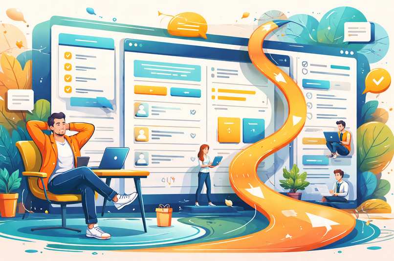
Designing for Decision Fatigue: How Website Layout Can Reduce User Overwhelm
 Scrolling through a poorly designed website can feel like walking into a supermarket where every aisle shouts at you in neon colors. Your brain wants to escape, your cursor hesitates, and your patience quietly packs its bags. This is decision fatigue in action. Every extra menu item, banner, pop-up, and competing call to action adds friction. Smart layout design works like a well-organized desk: fewer distractions, clearer priorities, and faster progress toward the task that actually matters.
For businesses and designers, reducing mental strain is not just about aesthetics. It directly affects engagement, trust, and conversions. When people can scan, understand, and act without effort, they stay longer and click with more confidence. Layout is the invisible guide that either escorts users smoothly or sends them wandering in circles.
Navigation Structure That Thinks Before Users Do
Navigation is often treated as a decoration instead of a decision tool. Yet it is the first place where cognitive load begins to pile up. When visitors land on a site, they want answers quickly. A clear structure anticipates common goals and presents them in a logical order.Limit primary navigation to essential categories. Too many options trigger hesitation. Group related pages under intuitive labels and avoid clever wording that forces people to interpret meaning. If someone needs to decode a menu, they will choose the fastest alternative: the back button.
Effective navigation also follows visual priority. Place the most important actions where eyes naturally travel, such as the top left or center of a page. Highlight a single primary action rather than promoting five competing ones. A focused menu quietly tells users what matters most, which is far more helpful than shouting every possibility at once.
Spacing That Gives the Brain Room to Breathe
White space is not empty space. It is active space that creates rhythm and separation. Without it, content collapses into a visual traffic jam. Crowded layouts force users to work harder just to distinguish one element from another.Generous spacing around headings, buttons, and sections improves scannability. It allows the eye to pause and reset before moving on. This subtle breathing room reduces fatigue and increases comprehension. When content feels lighter, users process information faster, even if the amount of text stays the same.
Margins and padding also guide attention. Wider spacing around key elements like calls to action naturally pulls focus without using aggressive colors or animations. Think of it as using silence in conversation. The pause makes the next statement feel more important.
Spacing also improves mobile usability, where cramped layouts quickly turn into accidental clicks and frustration. Touch-friendly spacing is not a luxury feature. It is basic hospitality for thumbs that do not enjoy precision gymnastics.
Content Hierarchy That Tells a Clear Story
Content hierarchy is the art of deciding what deserves attention first, second, and last. Without hierarchy, users face a wall of information that feels equally important, which usually results in nothing feeling important at all.Use clear heading levels, consistent typography, and visual contrast to establish structure. Large headings introduce topics. Subheadings provide direction. Body text delivers detail. This layered approach allows readers to skim intelligently and dive deeper when needed.
Hierarchy also applies to page flow. Place the most valuable information at the top and build supporting details below. This respects short attention spans while still offering depth for those who want it.
When hierarchy is done well, users do not notice it. They simply move through the page with confidence, as if the site politely rearranged itself to match their expectations.
Practical Layout Techniques That Actually Work
Good layout decisions do not require expensive tools or dramatic redesigns. Small changes often produce noticeable improvements. Start by reducing visual noise. Remove decorative elements that do not support a goal. If something does not guide, inform, or convert, it is probably just taking up oxygen.Next, use visual anchors. Buttons, cards, and featured sections should stand out through size and spacing rather than flashy effects. Consistency matters too. When buttons look the same across pages, users do not have to relearn how to interact each time.
Consider breaking content into digestible chunks. Long paragraphs intimidate tired eyes. Short blocks, clear lists, and scannable sections make information feel manageable.
- Limit the number of primary calls to action on each page
- Use consistent spacing between similar elements
- Apply contrast carefully to highlight priorities
- Group related content into visual sections
Serious Metrics That Prove Simpler Is Smarter
Now for the part that removes all doubt. Layout choices directly affect measurable performance. Reduced bounce rates, longer session durations, and higher conversion rates often follow usability improvements. This is not design theory. It is behavioral reality.Heatmaps and user recordings regularly show the same pattern. Visitors hesitate less when pages are organized logically. They scroll with purpose instead of confusion. They complete forms faster when layouts feel predictable and calm.
Accessibility improvements also strengthen usability for everyone. Clear contrast, readable fonts, and logical structure benefit users with disabilities, mobile users, and anyone browsing on a less-than-perfect screen. Designing for clarity is not niche work. It is universal optimization.
When Humor Meets Function Without Breaking Anything
A touch of personality can make interfaces friendlier, but it should never interfere with clarity. Clever microcopy on buttons or friendly empty states can reduce stress and humanize interactions. Just keep jokes out of critical instructions. Nobody wants to decode sarcasm while trying to reset a password.Tone can support usability when used carefully. Short, reassuring messages like "You are almost done" or "Saved successfully" provide feedback that keeps users oriented. These small details reduce uncertainty and keep momentum moving forward.
Layout should still do the heavy lifting. Humor enhances experience. Structure sustains it.
Decision Fatigue Exit Ramp
Reducing decision fatigue is less about controlling users and more about respecting their time and energy. Clear navigation, thoughtful spacing, and strong content hierarchy create a calm environment where choices feel obvious instead of overwhelming.A well-designed layout does not shout. It whispers directions and lets users move at their own pace. When visitors stop feeling lost, they start feeling confident. Confidence leads to action, and action leads to results.
Designing with mental energy in mind turns websites into helpful guides instead of obstacle courses. That shift is not flashy, but it is powerful. And unlike endless redesign trends, clarity never goes out of style.
Article kindly provided by devonto.com
Latest Articles
- Near Misses: The Most Valuable Workplace Incidents You're Probably Ignoring
- Choosing the Right Lifting Method Before Choosing the Equipment
- Why Visitors Ignore Half Your Homepage Within Three Seconds
- Why Most Cybersecurity Conversations Ignore the Biggest Vulnerability: Everyday Workflow Habits
- What Your Workplace Is Communicating Before Anyone Says a Word
- Planning an Office Renovation? Why Drywall Decisions Impact More Than Just the Walls
- The False Economy of Low-Cost Protective Solutions
- The Valuable Materials Hiding in Everyday Electronics
- The Hidden SEO Asset Most Small Businesses Ignore: Why Directory Listings Still Matter
- How to Renovate Without Losing Productivity: A Smarter Approach to Workplace Upgrades
- How One Day of Filming Can Become Months of Content
- The Invisible Traffic of Office Air: How Dust, Odors, and Allergens Move Through Workspaces
- From Gravel to Concrete: When Businesses Should Upgrade Outdoor Access Areas
- Landscape Design as Infrastructure: How Outdoor Spaces Influence Business Performance
- Why Venues Matter More Than Gear in Premium Photography
- What Perfume Sampling Reveals About Modern Buying Behaviour
- The Hidden Operational Cost of Delaying Vehicle Glass Repairs
- How Air Quality Became the Silent Workplace Issue Nobody Talks About
- How to Shoot for Post-Event Content Pipelines, Not Just the Day Itself
- Common Data Backup Mistakes People Make Without Realizing
- Sales and Marketing
- Human Resources
- Finance and Accounting
- Business Consulting
- Information Technology
- Supply Chain Management
- Manufacturing and Production
- Logistics and Transportation
- Risk Management
- Project Management
- Market Research
- Business Intelligence
- Customer Relationship Management
- Product Development
- Quality Assurance
- Outsourcing Services
- Procurement and Vendor Management
- Legal and Compliance
- Business Strategy
- Operations Management
- Leadership and Management
- Data Analytics
- Innovation and R&D
- Training and Development
- Ecommerce Solutions
- Public Relations
- Advertising and Promotion
- Branding and Identity
- Business Networking
- Event Management
- Office Environment